02 · Visual identity
Visual Identity: Foundations
Action Multisectorielle pour la Solidarité et le Développement
II
Visual identity at AMSODE
AMSODE’s visual identity translates into graphic language what the organisation is, what it stands for and how it intends to work alongside people and communities.
It is more than a logo, a colour palette or a set of typographic choices. It is a coherent system that enables AMSODE to express the same identity across its different areas of operation, programmes, partnerships and communication materials.
This identity is rooted in the organisation’s vision, mission and values. It must therefore be human-centred, inclusive, accessible and consistent, while remaining open to the diversity of the contexts in which AMSODE works.
↑ Back to contentsII.1
Foundations of the visual identity
AMSODE’s visual identity is founded on a fundamental conviction: every person deserves to be treated with dignity and to have equitable access to resources and opportunities.
This conviction is directly aligned with the organisation’s vision: to contribute to a world where development is free from inequality.
It also expresses AMSODE’s mission: to provide assistance to people and communities experiencing vulnerability, while upholding human dignity and contributing to sustainable and inclusive development.
AMSODE’s visual identity must reflect this approach in the way the organisation presents itself and communicates.
↑ Back to contentsII.2
The concept and symbolism of the logo
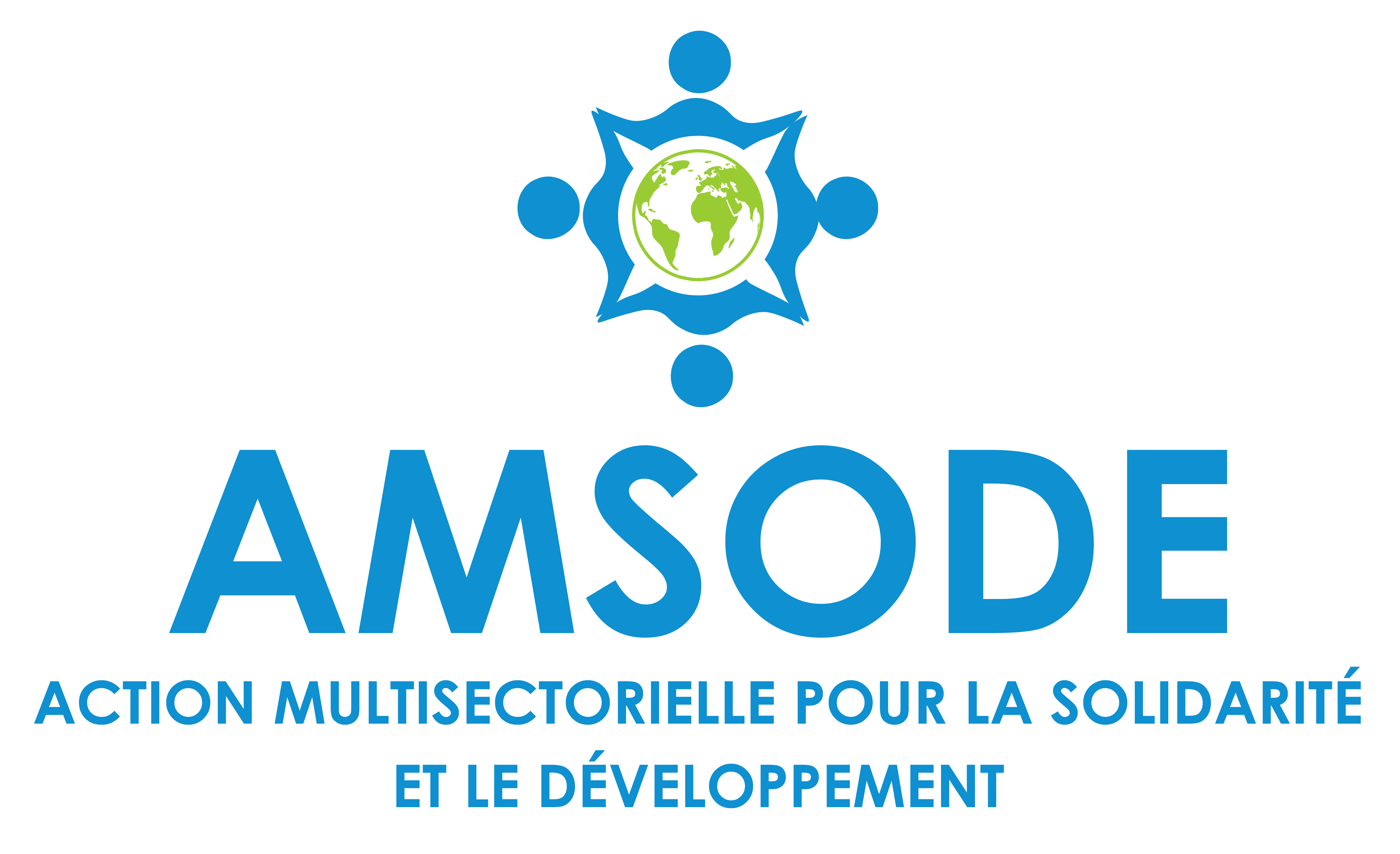
The logo is AMSODE’s principal visual identifier. Its design brings together two essential elements: the globe and the dots.
Together, these elements give the logo both a universal and a human dimension. They visually express AMSODE’s commitment to people and communities experiencing vulnerability, while recognising the diversity of human circumstances.
II.2.1
The globe
The globe expresses the universal character of human dignity and solidarity at the heart of AMSODE’s identity.
It conveys openness, solidarity and the universal reach of the principles that guide the organisation’s work.
Its geographical representation does not, by itself, define the organisation’s operational scope; it reflects principles that transcend borders and apply wherever people and communities face situations of vulnerability.
It thus expresses AMSODE’s ambition to contribute, within the scope of its work, to a more equitable and inclusive world.
↑ Back to contentsII.2.2
The dots
The dots that make up the symbol represent the diversity of people and communities.
↑ Back to contents