AMSODE / OFFICIAL BRAND GUIDELINES / ENGLISH
Official brand guidelines

The AMSODE visual identity

Eleven chapters bringing together the approved visual identity, institutional applications, templates and reference materials of Action Multisectorielle pour la Solidarité et le Développement.

Official contents

The eleven chapters

CHAPTER 01 / 11↑ Back to contents

01 · Institutional foundations

About AMSODE

Action Multisectorielle pour la Solidarité et le Développement

I.1

Identity and evolution

Action Multisectorielle pour la Solidarité et le Développement (AMSODE) is a national non-profit non-governmental organisation (NGO) that works alongside people and communities experiencing vulnerability, placing human dignity, inclusion and community participation at the heart of its work.

Through its interventions, AMSODE helps provide responses tailored to the needs of populations facing vulnerability, while strengthening their ability to participate fully in their communities’ development.

AMSODE adopts a multisectoral approach that seeks to address the different dimensions of vulnerability and strengthen the capacities of individuals and communities. This approach rests on a central conviction: assistance and development can only be sustainable when they take account of local realities, existing resources and communities’ ability to shape their own future.

As the organisation and its identity evolve, AMSODE seeks to strengthen the consistency between who it is, what it does and how it presents itself. Its visual identity reflects this ambition: to build a clear, consistent and recognisable institutional image while remaining faithful to the principles underpinning its work.

↑ Back to contents

I.2

Vision

“A world where development is free from inequality and everyone has equitable access to resources and opportunities.”

AMSODE’s vision is rooted in a straightforward aspiration: to contribute to a world in which inequality is no longer an obstacle to people’s dignity, participation and development.

It places equity at the centre of development and recognises that everyone, whatever their circumstances, must be able to access the resources and opportunities they need to shape their future.

This vision looks beyond an immediate response to vulnerability. It also expresses the ambition to help build more inclusive communities that can make the most of their resources, strengthen their capacities and take part in decisions concerning their own development.

↑ Back to contents

I.3

Mission

“To provide assistance to people and communities facing vulnerability, while upholding human dignity, and to contribute to sustainable and inclusive development.”

AMSODE’s mission brings together two complementary dimensions: responding to vulnerability and contributing to development.

Assistance responds to the needs of people and communities experiencing vulnerability. It must be provided with respect for human dignity, without discrimination and with due regard for the circumstances and needs of each context.

At the same time, AMSODE seeks to make its work sustainable. This involves strengthening community capacities, recognising local resources and encouraging participation so that communities can progressively reinforce their autonomy and ability to act.

This link between assistance, inclusion and development is central to AMSODE’s institutional positioning.

↑ Back to contents

I.4

AMSODE’s values

AMSODE’s values are the principles that guide its work and its relationships with communities, staff and partners.

They provide the organisation with a shared framework and help ensure that its interventions remain consistent with its vision and mission.

I.4.1 Inclusion

For AMSODE, inclusion means that everyone should be able to take part in the life and development of their community. It requires recognising the diversity of people’s situations, experiences and circumstances, and ensuring that no one is left behind.

Inclusion therefore guides the way AMSODE designs and implements its interventions, with particular attention to people and groups who are most vulnerable or at risk of marginalisation.

I.4.2 Transparency

Transparency is central to the relationship of trust that AMSODE seeks to build with communities, partners and all its stakeholders.

It is reflected in responsible resource management, clear communication about activities and a commitment to being accountable for results, decisions and responsibilities.

I.4.3 Collaborative action

No single actor can overcome the challenges faced by communities alone. AMSODE regards collaboration as an essential way to increase the reach and relevance of its interventions. Collaborative action is founded on dialogue, complementary expertise and partnerships built around shared objectives.

It reflects AMSODE’s commitment to working with communities, civil society organisations, humanitarian actors, institutions and other stakeholders who promote human dignity and sustainable development.

I.4.4 Empowerment

For AMSODE, supporting a community does not mean acting on its behalf. It means strengthening its capacities, recognising its resources and local knowledge, and creating the conditions for its active participation.

This approach seeks to progressively strengthen people’s and communities’ capacity to identify their priorities, mobilise their resources and participate in decisions that shape their future.

↑ Back to contents

I.5

Institutional positioning

AMSODE positions itself as an organisation working alongside people and communities experiencing vulnerability, at the intersection of responding to needs, supporting communities and contributing to sustainable development.

Its approach aims to bring interventions closer to people’s lived realities. Knowledge of local contexts, dialogue with communities and the mobilisation of relevant actors are essential to this approach.

AMSODE therefore works through proximity, complementarity and responsibility, seeking responses tailored to local circumstances and the needs of populations.

Its multisectoral identity reflects its commitment to considering vulnerability as a whole and providing responses that take account of its different dimensions.

These brand guidelines provide a shared framework. They ensure that every item produced by AMSODE—whether a report, digital publication, awareness-raising material, institutional document or field tool—contributes to one coherent identity.

↑ Back to contents

I.6

How we describe AMSODE

AMSODE is a humanitarian and development organisation that works alongside people and communities experiencing vulnerability, in contexts marked by crises, displacement, inequality and difficulties in accessing essential services.

Through its interventions, AMSODE helps respond to people’s needs while strengthening their capacities and their participation in the development of their communities.

I.6.1 Who we are

AMSODE, Action Multisectorielle pour la Solidarité et le Développement, is an organisation that places human dignity, inclusion and equity at the heart of its work.

Its approach is based on close engagement with communities, partnerships with different actors and the search for responses tailored to local realities and the circumstances of the people it supports.

I.6.2 Who we work with

AMSODE works with people and communities facing different forms of vulnerability, including:

Internally displaced persons (IDPs); refugees and the communities hosting them; vulnerable individuals and households; women and girls; children and adolescents; people exposed to protection risks; communities affected by crises and shocks; host communities and other populations reached by its interventions.

In its communications, AMSODE takes care to refer to people respectfully and never to reduce their identity to their experience of vulnerability.

I.6.3 Our areas of intervention

AMSODE works across complementary sectors to provide responses tailored to the needs of individuals and communities.

Its interventions include:

Health and sexual and reproductive health; protection; education; food security and livelihoods; water, sanitation and hygiene; humanitarian assistance and cash transfers; social cohesion and community resilience; communication, awareness-raising and community engagement.

I.6.4 How we communicate our work

When communicating about AMSODE, we aim to show the needs we address, the actions we undertake and the changes to which we contribute.

Our communications should therefore follow a straightforward sequence:

NEEDS → ACTION → RESULTS → CHANGE

They should make it easy to understand:

Who are we?; Who do we work with?; What do we do?; Why does it matter?

We avoid presenting people solely through their difficulties or vulnerability. We also recognise their capacities, participation, initiatives and contributions to the changes that affect them.

↑ Back to contents

I.7

Our tone of voice

AMSODE’s tone of voice reflects its identity as a humanitarian and development organisation and helps build trust with communities, partners, authorities, the media and other stakeholders.

Across all its communications, AMSODE uses a measured, factual, humane and accessible tone. Language must convey information accurately, reflect realities on the ground and uphold the dignity and participation of the people concerned.

I.7.1 Editorial principles

Clear and accessible: Use simple, precise and comprehensible language. Avoid complex phrasing, unexplained acronyms and institutional jargon when unnecessary.

Factual and rigorous: Present verified information and clearly distinguish facts, data, testimonies and analysis. Published figures and results must be supported by evidence.

Dignified and respectful: People and communities must not be reduced to their experience of vulnerability. Content must protect their dignity, privacy and integrity.

Neutral and responsible: Avoid sensationalist, dramatic language or wording likely to reinforce prejudice. Describe humanitarian situations accurately, without exaggeration.

Inclusive and non-discriminatory: Use language that recognises people’s and communities’ diversity and does not perpetuate stereotypes related to gender, age, disability, origin or any other characteristic.

People- and solution-focused: Highlight needs, responses, results and observed changes, while making space for the voices and participation of the people concerned.

Consistent and professional: Maintain the same editorial standards across all AMSODE materials: institutional documents, reports, press releases, social media, audiovisual content, testimonies and advocacy materials.

I.7.2 What to avoid

In particular, AMSODE avoids:

Sensationalist or alarmist language; unsubstantiated generalisations; terms that may stigmatise or dehumanise people; portraying people solely through vulnerability; paternalistic language that presents communities as passive; claims or figures that cannot be verified; excessively promotional or self-congratulatory wording.

↑ Back to contents

I.8

Preferred language

The terminology used in AMSODE communications must reflect a rights-based approach grounded in human dignity, inclusion and participation.

Recommended vocabulary
PreferredAvoid or use with care
People experiencing vulnerabilityThe vulnerable
Internally displaced persons (IDPs)The displaced
People affected by a crisisVictims, unless the term is specifically justified
People supportedAid recipients, when used to define people solely by their status
Persons with disabilitiesThe disabled
Girls and boys / childrenLittle kids, youngsters
Affected communitiesVictim populations
Support / accompanyTake charge of
SupportSave
Strengthen capacitiesTrain beneficiaries, when the objective is broader than training
Facilitate access to servicesGive services
Community participationMake communities participate
Response / assistance / supportAid, when the term is too general
Results / observed changesSpectacular impacts
People and communitiesOur beneficiaries, when the term reduces people to their status
↑ Back to contents
CHAPTER 02 / 11↑ Back to contents

02 · Visual identity

Visual Identity: Foundations

Action Multisectorielle pour la Solidarité et le Développement

II

Visual identity at AMSODE

AMSODE’s visual identity translates into graphic language what the organisation is, what it stands for and how it intends to work alongside people and communities.

It is more than a logo, a colour palette or a set of typographic choices. It is a coherent system that enables AMSODE to express the same identity across its different areas of operation, programmes, partnerships and communication materials.

This identity is rooted in the organisation’s vision, mission and values. It must therefore be human-centred, inclusive, accessible and consistent, while remaining open to the diversity of the contexts in which AMSODE works.

↑ Back to contents

II.1

Foundations of the visual identity

AMSODE’s visual identity is founded on a fundamental conviction: every person deserves to be treated with dignity and to have equitable access to resources and opportunities.

This conviction is directly aligned with the organisation’s vision: to contribute to a world where development is free from inequality.

It also expresses AMSODE’s mission: to provide assistance to people and communities experiencing vulnerability, while upholding human dignity and contributing to sustainable and inclusive development.

AMSODE’s visual identity must reflect this approach in the way the organisation presents itself and communicates.

↑ Back to contents

II.2

The concept and symbolism of the logo

The logo is AMSODE’s principal visual identifier. Its design brings together two essential elements: the globe and the dots.

Together, these elements give the logo both a universal and a human dimension. They visually express AMSODE’s commitment to people and communities experiencing vulnerability, while recognising the diversity of human circumstances.

AMSODE full vertical official logo
AMSODE · Full vertical official logo
↑ Back to contents

II.2.1

The globe

The globe symbolises AMSODE’s commitment to providing assistance and protection to the most vulnerable people and communities, wherever they may be in the world.

It conveys openness, solidarity and the universal reach of the principles that guide the organisation’s work.

Beyond its geographical representation, the globe is a reminder that human dignity knows no borders and that solidarity can be expressed wherever people and communities face vulnerability.

It thus expresses AMSODE’s ambition to contribute, within the scope of its work, to a more equitable and inclusive world.

↑ Back to contents

II.2.2

The dots

The dots that make up the symbol represent the diversity of people and communities.

↑ Back to contents
CHAPTER 03 / 11↑ Back to contents

03 · Logo

Logo

Compositions, clear space and use

III

Logo: purpose and official files

The AMSODE logo is the principal visual identifier of Action Multisectorielle pour la Solidarité et le Développement. This chapter brings together the official logo files and sets out the basic rules for preserving legibility, proportions and consistency across all applications.

↑ Back to contents

III.1

Choosing the right composition

The files shown below come exclusively from AMSODE’s official logo set. The full vertical version is the primary reference.

↑ Back to contents

III.2

Approved variants

VERY SMALL FORMAT

Standalone symbol

Official AMSODE standalone symbol

Reserved for contexts where AMSODE is already identifiable: favicons, profile pictures, digital icons and secondary graphic elements.

↑ Back to contents
DARK BACKGROUND

White version

Official AMSODE white version

Use only when the background does not allow the colour or black version to retain sufficient contrast.

↑ Back to contents
MONOCHROME

Black version

Official AMSODE black version

For monochrome reproduction, technical documents or printing constraints that do not allow the institutional colours.

↑ Back to contents
↑ Back to contents
CHAPTER 04 / 11↑ Back to contents

04 · Colours and Typography

Colours and Typography

The AMSODE blue and green are the organisation's signature colours. Used with legible typography, they bring consistency to communications while allowing people and the message to remain the focus.

4.1

Official colour palette

The following are the colours of the official AMSODE logo. The supporting colours used for text and page layouts do not add new colours to the logo.

Colour Reference Intended use
AMSODE Blue — primary #0099CC · RGB 0, 153, 204 Identity markers, solid areas, digital visuals, large headings and brand elements.
AMSODE Green — complementary #99CC33 · RGB 153, 204, 51 Discreet accents, rules, highlights, selected markers and complementary identification.

Logo integrity: never recolour the official logo using these values. Always use the supplied official logo files, with the full vertical logo as the primary reference.

↑ Back to contents

4.2

Supporting colours and readability

Neutral colours organise text, pages and dividers. Darker blue is used when smaller text requires stronger contrast.

Function Reference Intended use
Main text #15323D Body text and interfaces.
Reading blue #005B7C Links and small text requiring contrast.
Secondary background #F4F8FA Page composition and discreet content separation.
White #FFFFFF Clear space and contrast.

Blue identifies AMSODE; green highlights selected information. White space ensures that photographs and written content remain the priority. Limit large blocks of colour to a useful area; do not make green the default colour for running text. Maintain the same visual hierarchy across reports, presentations, field materials and digital communications.

↑ Back to contents

4.3

Typographic references

The families below are taken from the AMSODE reference materials. Their use depends on the medium and on the availability of licensed fonts.

  • Proxima Nova: historical graphic reference for headings and visual messages. When unavailable, use an appropriate system substitute; do not distribute font files.
  • Lato: a secondary family suitable for captions, short text blocks and interfaces where its use is authorised.
  • Arial and Calibri: practical substitutes for correspondence, Word templates, tables and internal tools. The approved templates determine the precise application.
  • Times New Roman: the reading typeface used for the editorial presentation of the Brand Book. It does not replace the lettering of official logos or the typefaces of previously approved materials.
↑ Back to contents

4.4

Hierarchy from headings to captions

Use a clear hierarchy between the main title, secondary title, body text, captions and sources. Avoid excessively small type. Final sizes depend on the medium, viewing distance and available space. Use adequate line spacing and contrast; graphic consistency must never compromise readability.

Application: the same colour and typographic principles extend to the graphic system described in Chapter 05.

↑ Back to contents

Identity colours

AMSODE Blue#0099CC
AMSODE Green#99CC33

Use the official image files for every reproduction of the logo.

CHAPTER 05 / 11↑ Back to contents

05 · Graphic System

Graphic System

The AMSODE graphic system brings together restrained forms, consistent pictograms, respectful photography and a clear visual hierarchy. Its purpose is to make every medium recognisable without letting decoration compete with the content.

5.1

Six principles, one system

Graphic elements support the information. The same principles apply to institutional reports, digital content and field communications.

  1. Simplicity — one main message. Every material must have an immediately identifiable message; supporting information comes second.
  2. Restraint — fewer effects, more space. Limit decorative elements, competing colours and unnecessary textures.
  3. Hierarchy — guide the reader's eye. Clearly distinguish the title, key data, supporting text and source.
  4. Consistency — reuse the same visual conventions. Maintain consistent alignment, margins, pictograms and photographic treatment.
  5. Readability — preserve contrast. A visual should be understandable on mobile devices, on screen and in print.
  6. Adaptability — compose for each format. Retain the AMSODE identity while adapting the grid to the medium.
↑ Back to contents

5.2

The ten AMSODE pictograms

The AMSODE vector pictograms share a common grid, stroke weight and proportions. Use one pictogram family throughout a given material; do not combine it with unrelated icon styles. The approved individual SVG files belong to the design resource library.

No. Pictogram No. Pictogram
01 Education 06 Livelihoods
02 Health 07 Gender and equity
03 Protection 08 Inclusion
04 Water and hygiene 09 Communities
05 Food security 10 Location

Usage: preserve stroke weight, proportions and clear space. Pictograms supplement information; they do not replace an accurate caption or source.

↑ Back to contents

5.3

Before and after: give information room to breathe

The same editorial content becomes easier to read when arranged on a clear grid, with regular margins, a well-defined heading and a single accent colour.

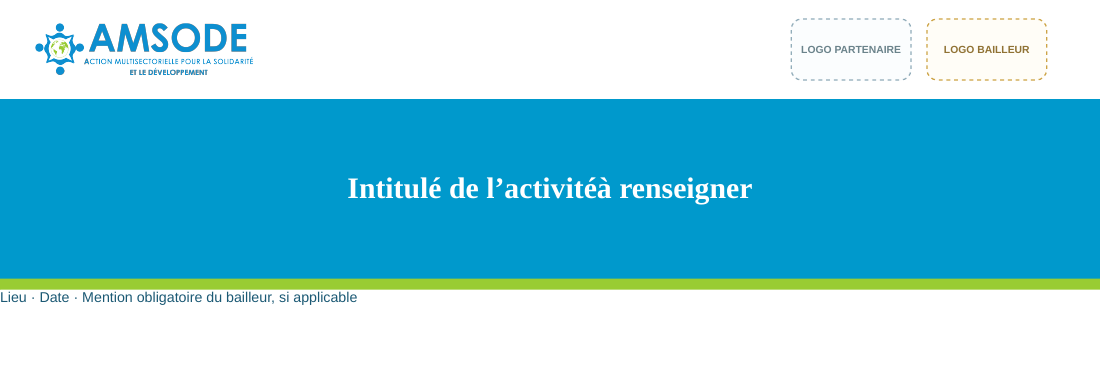
Before — no consistent system: information on community awareness activities, participant mobilisation and discussions about the priority needs of the communities concerned appears together with dates, locations, partners, contacts and other details, without an established hierarchy.

After — AMSODE identity: a clear activity heading is followed by a short contextual message, such as: “Community discussions to identify needs, recognise local initiatives and strengthen participation.” Date, location and verified practical information are placed separately.

↑ Back to contents

5.4

Show results without distorting them

Use one prominent measure followed by relevant supporting dimensions. Every figure must be linked to an actual source, a defined period and an explicit unit. Charts should use a shared axis, a limited colour palette and readable labels.

The key-figure and sample distribution compositions are layout examples only. Illustrative values must never be presented as actual AMSODE results. Replace them with checked project data before publication.

↑ Back to contents

5.5

One visual language across different materials

  • Institutional report: discreet header, title, reporting period, generous space and a consistent editorial grid.
  • Communication visual: a concise message on an authorised photograph, designed for immediate understanding.
  • Event material: the official logo, a structured grid, carefully chosen colour areas and clearly prioritised information.

The detailed templates and their approved files are available in the AMSODE resource library. The rules for photography and representation are set out in Chapter 06.

↑ Back to contents

Approved pictograms

Education pictogram
Education
Health pictogram
Health
Protection pictogram
Protection
Water and hygiene pictogram
Water and hygiene
Food security pictogram
Food security
Livelihoods pictogram
Livelihoods
Gender and equity pictogram
Gender and equity
Inclusion pictogram
Inclusion
Communities pictogram
Communities
Location pictogram
Location
CHAPTER 06 / 11↑ Back to contents

06 · Imagery and Representation

Imagery and Representation

AMSODE images show people, communities and activities in their context. Every publication must balance the relevance of the story with dignity, consent and protection.

6.1

Six AMSODE photographic references

The six original photographs supplied by AMSODE are presented as institutional references. Reuse remains subject to the applicable publication permissions and safeguarding requirements. The six editorial categories are:

  1. Activities with communities.
  2. Support provided in a healthcare setting.
  3. Dialogue and awareness-raising.
  4. An exchange with a female community member.
  5. Field monitoring and documentation.
  6. Collective activities and distributions.

Use these photographs only within the scope of verified publication permissions and AMSODE safeguarding procedures. Their appearance in this guide does not grant unrestricted reuse.

↑ Back to contents

6.2

Authentic, contextualised and people-centred photography

A photograph should complement the information without staging a person or attributing undocumented results to them.

  • Show the action. Prefer real activities, natural interactions and gestures, with enough context to understand the situation.
  • Preserve dignity. Avoid humiliating poses, sensationalism and images that reduce a person to their vulnerability.
  • Tell the story accurately. Provide factual captions with verified activity, location and date, appropriate context and photographic credit.
  • Respect the composition. Preserve the image's proportions and an uncluttered area for the official logo and caption, without hiding the subject.
  • Combine image, context and identification. The title identifies the topic, the caption records what has been documented and the official AMSODE logo identifies the organisation without altering the photograph.
↑ Back to contents

6.3

Recommended and unsuitable uses

The compositions shown in the reference guidelines are educational layout examples; they do not judge the people photographed.

Recommended: show people actively participating, explain the activity and preserve natural framing and context.

Avoid: images taken without the applicable permission, the exposure of sensitive situations and cropping or captions that misrepresent what happened.

↑ Back to contents

6.4

Check consent before publication

The supplied consent form is the documentary starting point. It covers the capture of images, audio and text; communication uses; possible sharing with partners; withdrawal; and the signature of a parent or guardian for children, as applicable.

  1. Inform: explain the recording, its purpose, the intended publication media and any possible sharing.
  2. Obtain consent: secure the permission required by the circumstances and AMSODE safeguarding procedures; check the parent or guardian's signature for a child when required.
  3. Verify: confirm the scope of permission, photographic credit, the person's safety and any project or donor requirements.
  4. Store records and respect choices: retain evidence in a protected internal location and handle withdrawal requests under the applicable commitments.

Official organisation name for consent documentation: Action Multisectorielle pour la Solidarité et le Développement.

↑ Back to contents

6.5

Safeguarding takes precedence over visibility

Permission from a parent or guardian may be necessary under AMSODE procedures, but it never replaces a risk assessment of the image, context, identity, location and potential circulation.

  • Check permission: verify the applicable authorisation and internal safeguarding procedure before taking or releasing an image.
  • Protect identity: do not unnecessarily associate a photograph with a full name, address, school or sensitive personal circumstances.
  • Choose safe framing: where the risk warrants it, use non-identifying framing or refrain from publication.
  • Reassess before sharing: also check captions, location data, metadata and the possibility of republication by partners.
↑ Back to contents

6.6

Success Stories: a faithful account of people's experiences

The AMSODE story template structures narratives around the context, intervention, observed results, future perspectives and illustrations. Testimonies and results must be verifiable and authorised.

Element Editorial requirement
Title and context Accurate title, objective, duration and verified project location.
Initial situation Respectful account of the person or community, where publication is authorised.
Intervention Actions taken, actors involved and means used.
Observed results Documented changes, relevant period and explicit source.
Testimony and outlook Exact quotations used with permission, future perspectives and the story's limits.
Illustrations Approved photographs, videos, captions and credits.

These rules apply across AMSODE correspondence, reports, posters, textiles, banners and roll-up displays.

↑ Back to contents

AMSODE photographic references

Photographs supplied by AMSODE. Reuse remains subject to applicable permissions, safeguarding and credits.

AMSODE original photograph, reference 01
Reference 01
AMSODE original photograph, reference 02
Reference 02
AMSODE original photograph, reference 03
Reference 03
AMSODE original photograph, reference 04
Reference 04
AMSODE original photograph, reference 05
Reference 05
AMSODE original photograph, reference 06
Reference 06
CHAPTER 07 / 11↑ Back to contents

07 · Institutional Stationery

Institutional Stationery

AMSODE's institutional stationery brings together correspondence, professional identification, distinctions and meeting materials. The approved examples are based on the organisation's actual references, with the official logo, a consistent information hierarchy, appropriate margins and continuity between the institutional blue and green.

7.1

General rules

The official logo, validated institutional contact details and a clear hierarchy must appear consistently on correspondence. Badges, business cards, certificates and nameplates are personalised for each use. Sample fields are not valid identification details; the competent AMSODE departments authorise named documents and their circulation.

Official correspondence

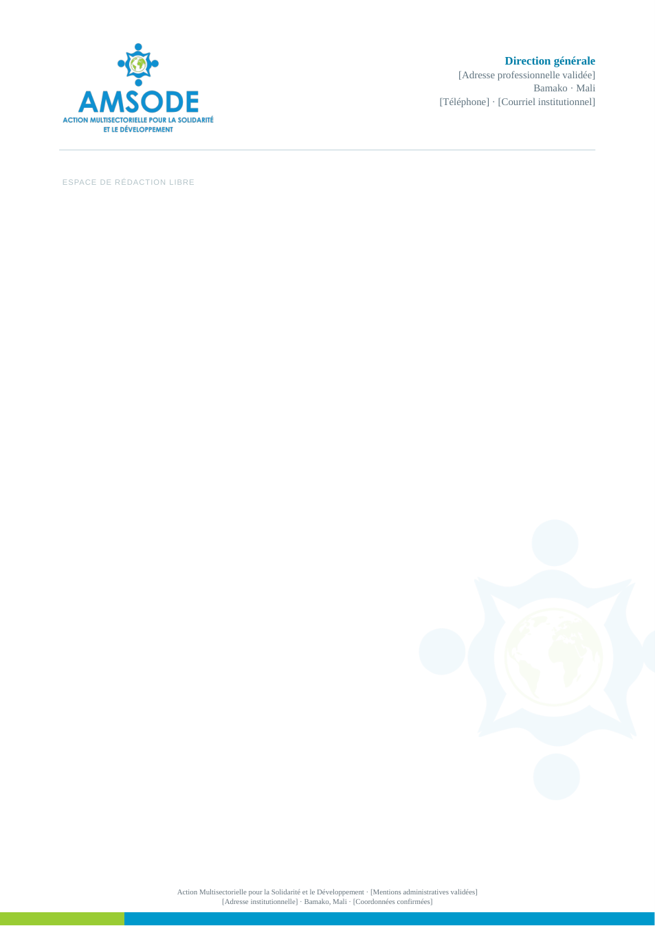
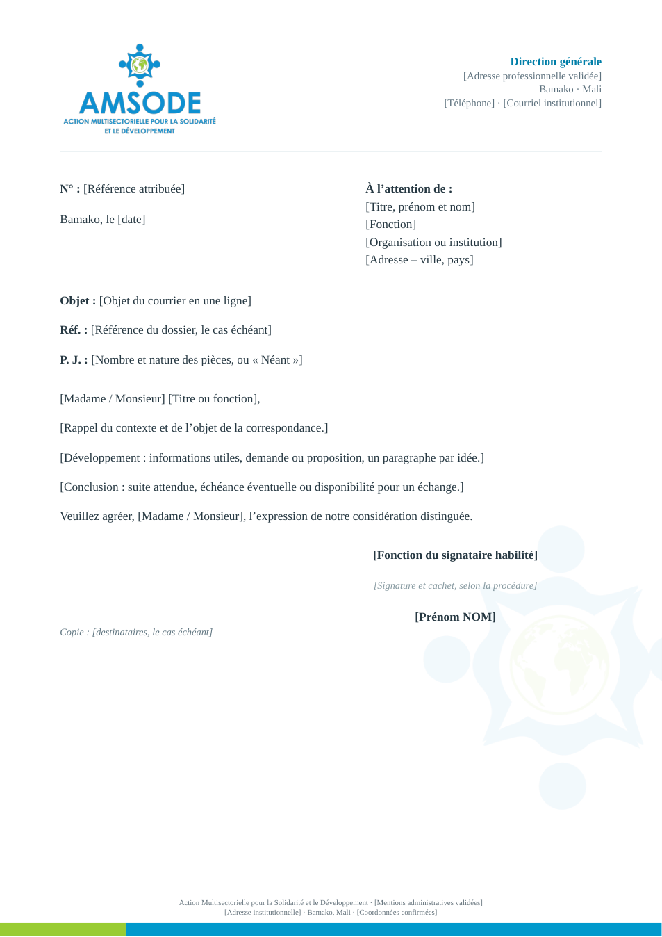
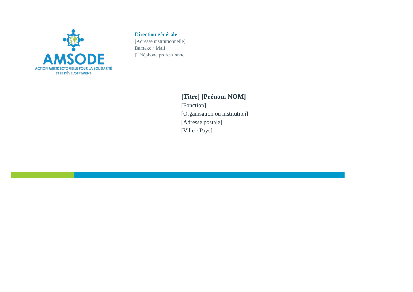
The letterhead positions the official logo in a clear area and leaves sufficient space for the text. The watermark must remain discreet; contact details and the authorised signatory must be checked. An official letter clearly separates the reference, recipient, subject, body and signature.

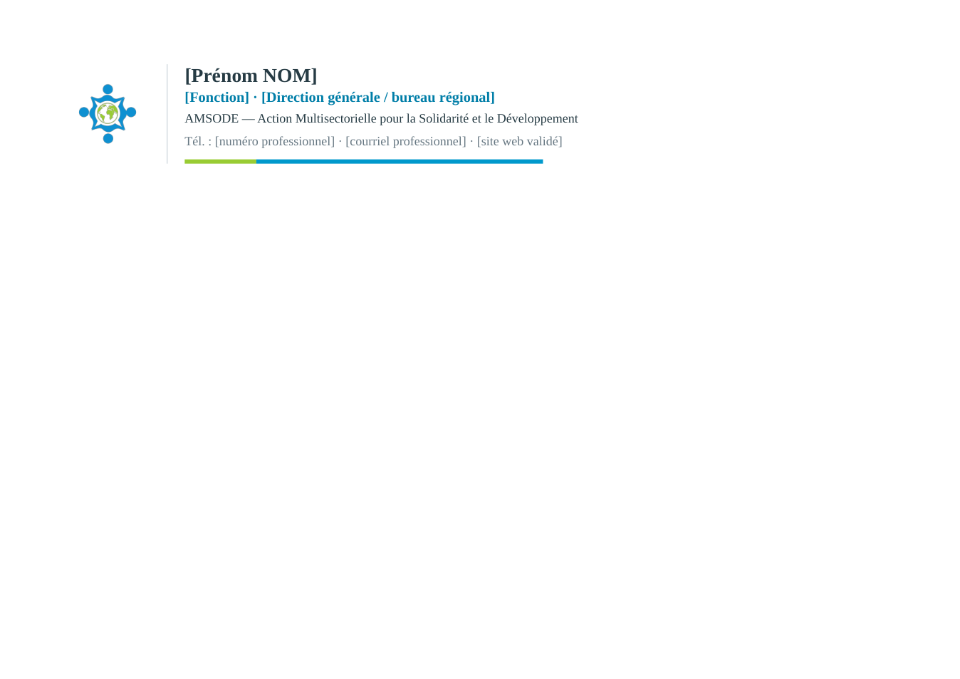
Email signatures and production

The email signature must be checked in the email clients used by AMSODE. Envelope dimensions, folder cuts, folds, creases and bleed margins must be confirmed with the production supplier.

Identification and distinctions

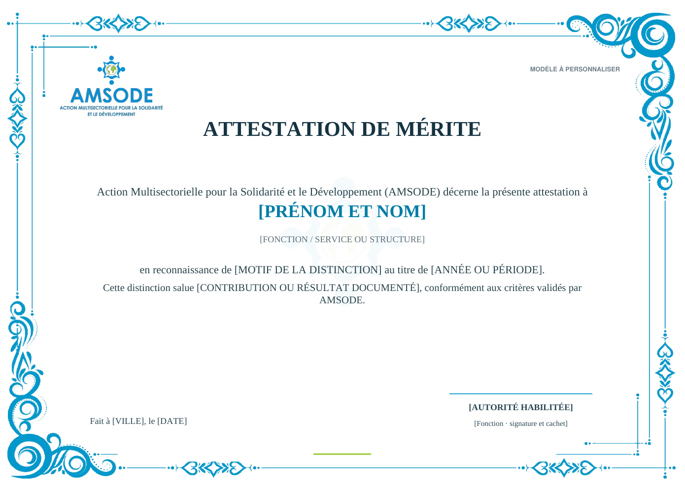
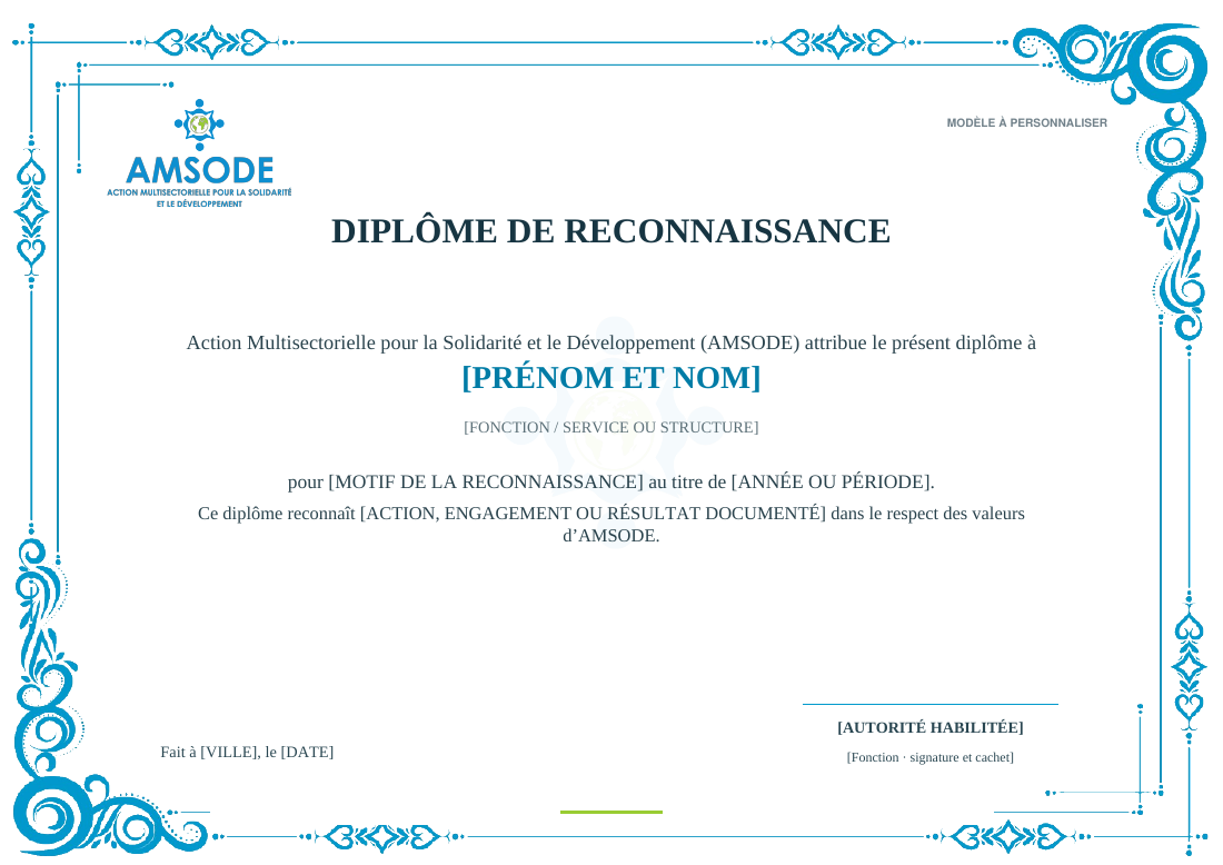
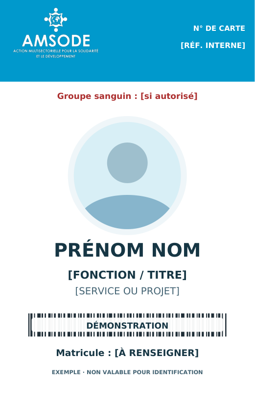
Staff badges are personal. Photographs, job titles, staff numbers and any blood-group information are governed by internal authorisations. Certificates and diplomas must state a verified reason for the distinction and identify the authorised signatory.

Desk nameplates and place cards

The printed insert and the acrylic holder are separate items. Confirm the insert dimensions against the holder before printing or producing conference nameplates.

↑ Back to contents

7.2

Official correspondence and folders

Approved model Specification and use Working format
A4 letterhead Official logo, validated contact details and adequate writing space. Editable Word
Official A4 letter Reference, recipient, subject, body and authorised signatory. Editable Word
Email signature Personalise and check in the actual email client before use. Consultable model and Word reference
Institutional envelope Defined sender and recipient areas; confirm production dimensions. PDF
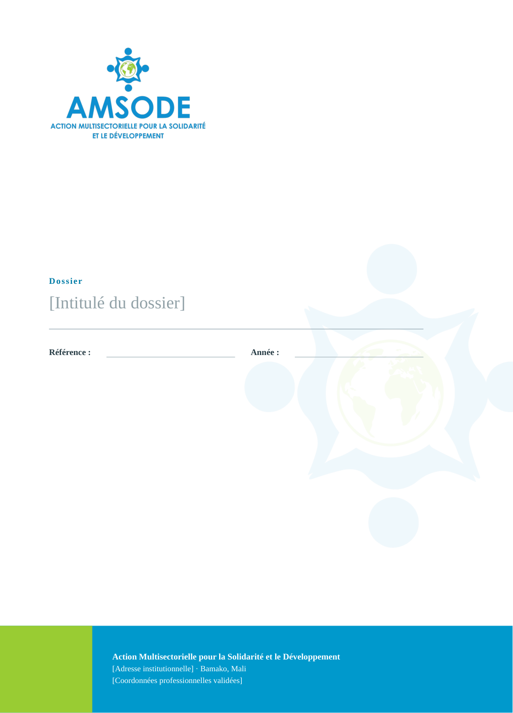
Institutional folder Reference size 230 × 320 mm; confirm cutting and creasing with the supplier. PDF
↑ Back to contents

7.3

Institutional distinctions

Approved model Specification and use Working format
Certificate of Merit Named award with a documented reason, date and authorised signatory. Editable Word and PDF
Diploma of Recognition Distinction based on verified facts and the appropriate authorisation. Editable Word and PDF

The wording and signatory must match the distinction actually awarded; historical example names and signatures are not part of reusable templates.

↑ Back to contents

7.4

Professional identification

Approved model Specification and use Working format
Staff badge 54 × 86 mm, front and back; printed personal data only after approval. PDF reference
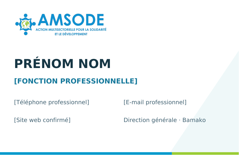
Business card 85 × 55 mm, front and back; validated professional contact details. PDF reference

A sample barcode is not a working staff identifier. Never publish actual staff numbers or sensitive details in a public example.

↑ Back to contents

7.5

Meetings and representation

Approved model Specification and use Working format
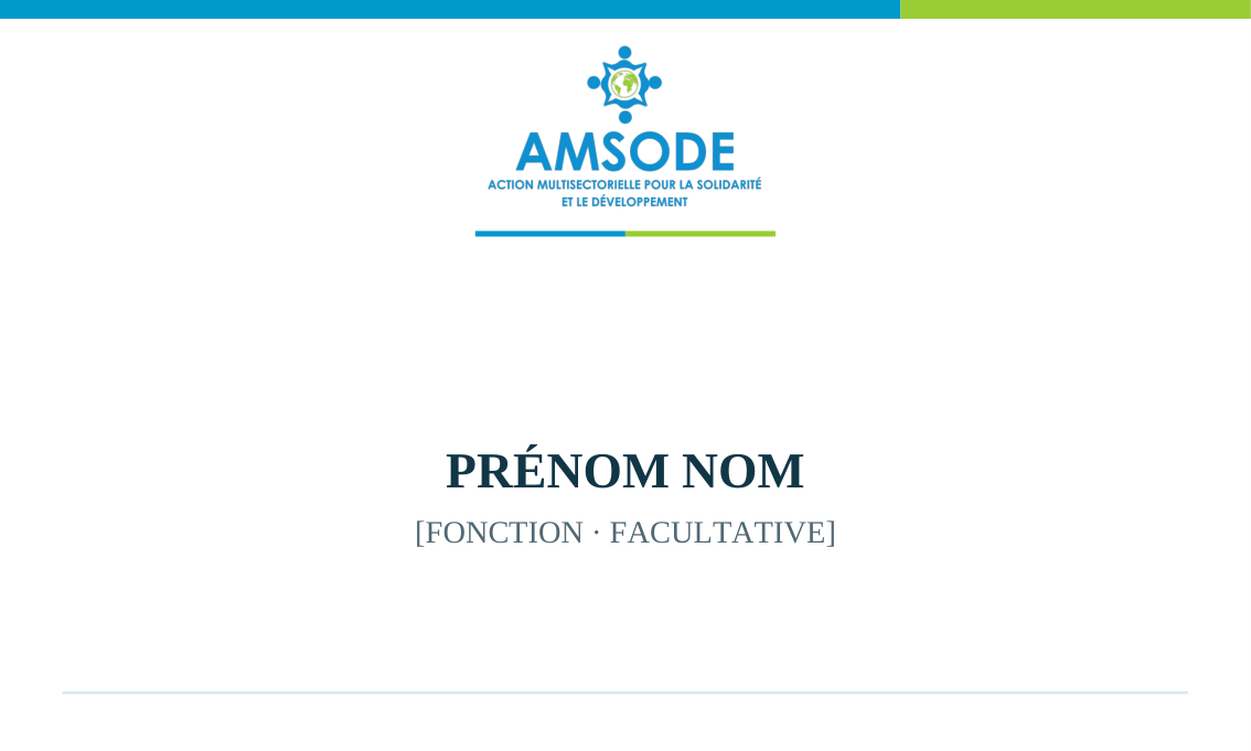
Acrylic desk nameplate Flat printed insert 297 × 105 mm; the transparent holder is shown in the web preview. Editable Word and PDF insert
Standard place card Personalised insert 100 × 60 mm. Editable Word and PDF insert
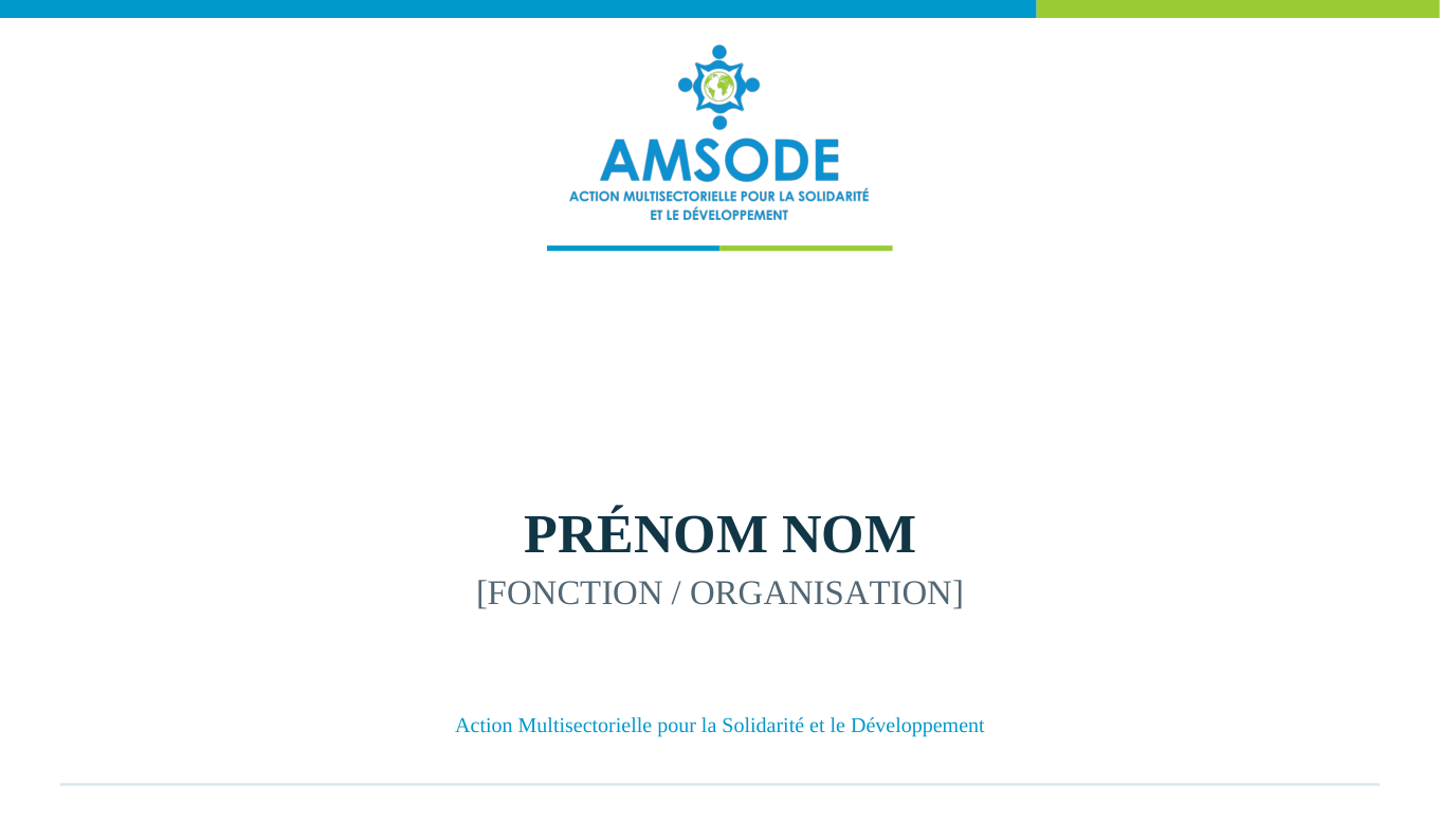
Event place card Personalised insert 120 × 70 mm, showing name, role and organisation. Editable Word and PDF insert

Consultation and downloads: colleagues may view the approved layouts in the portal. Only the authorised PDF and editable Word files are offered for download; HTML is not a downloadable deliverable.

↑ Back to contents

Browse approved reference models

The approved working templates listed below are currently in French. The PDF layouts and editable source files retain their approved formats. Preview pages open in the browser; HTML files are not downloadable.

CHAPTER 08 / 11↑ Back to contents

08 · Reports and Publications

Reports and Publications

AMSODE uses a consistent editorial system for activity reports, project briefs, thematic publications and documented stories of change. Layout examples must never be presented as actual operational results.

8.1

Editorial and production requirements

Every publication must be identifiable, legible and verifiable. Reported findings come from checked data; photographs must comply with consent and safeguarding rules. Editable Word files are the working templates, PDF files show the intended appearance, and web previews explain the layout.

Covers and inside pages

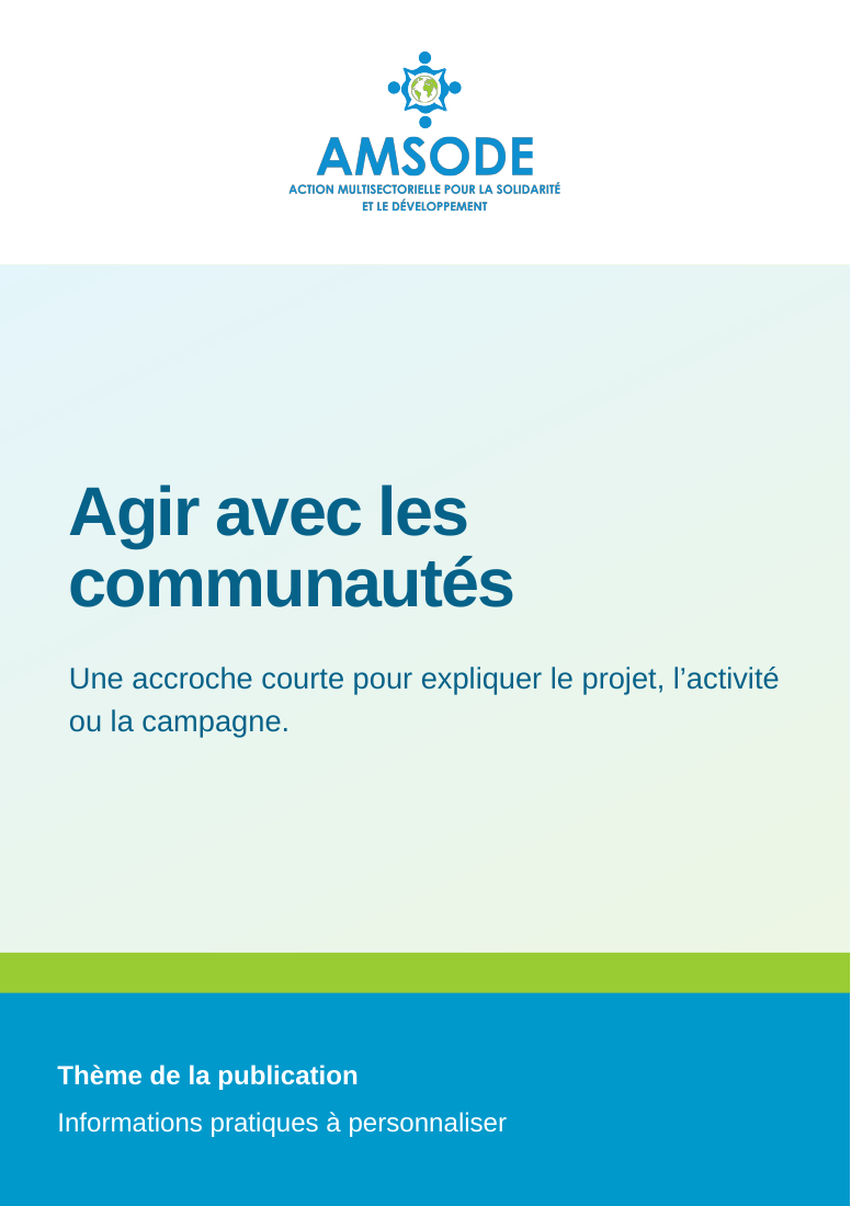
Reports and publications use a stable grid, hierarchical headings, a discreet header, properly documented captions and a consistent footer. Photographs must be authorised for the intended publication and audience.

Data and results

Every indicator must identify its period, coverage, unit and source. Never present sample figures or design placeholders as measured AMSODE results.

Stories and thematic publications

A Success Story follows the AMSODE template: context, intervention, observed results, outlook and captioned illustrations. Testimonies must retain the meaning of the words actually recorded and must be used with permission.

↑ Back to contents

8.2

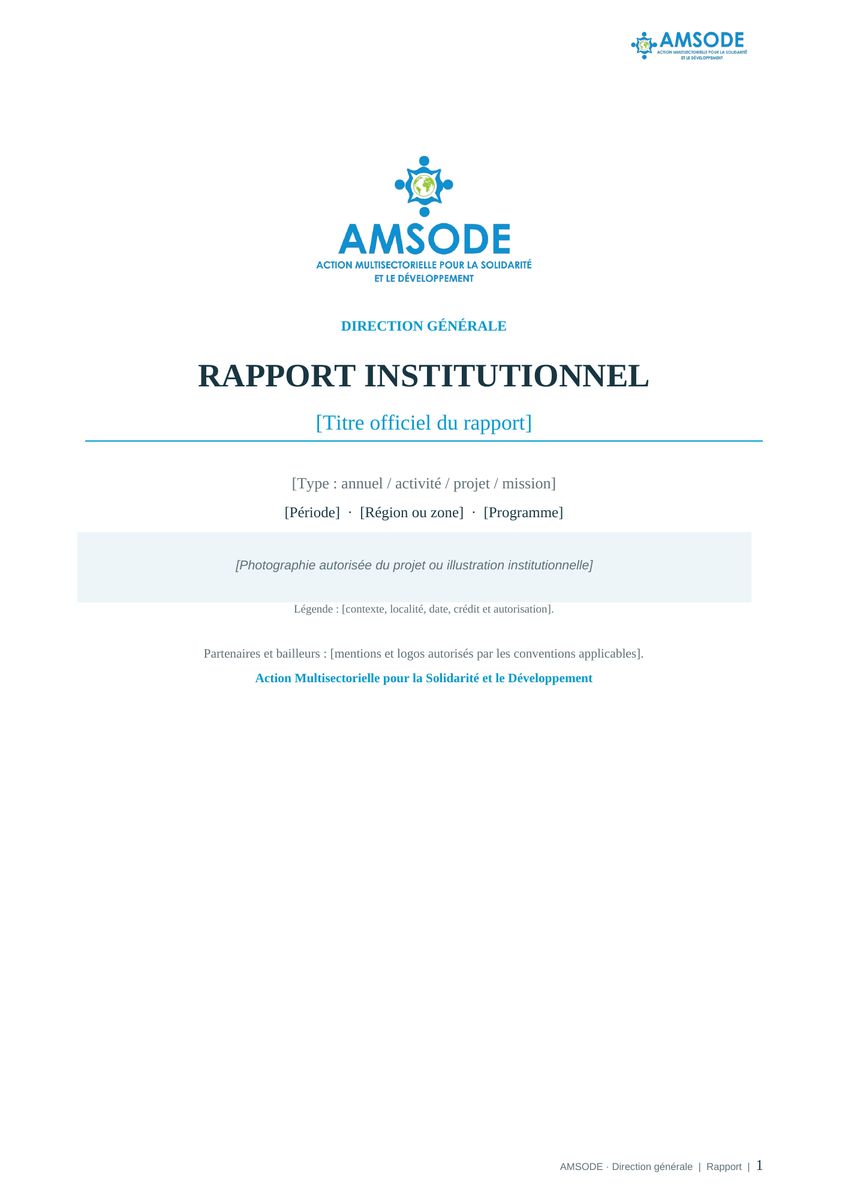
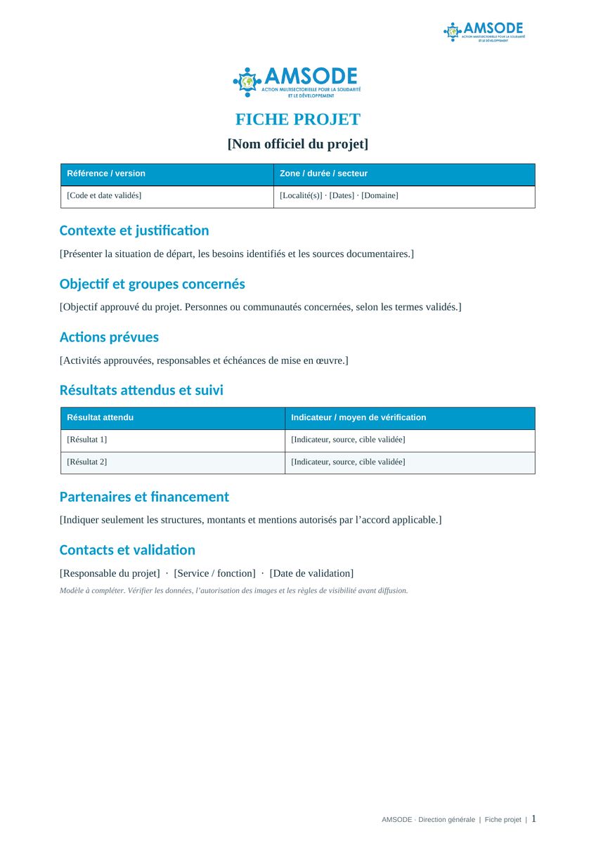
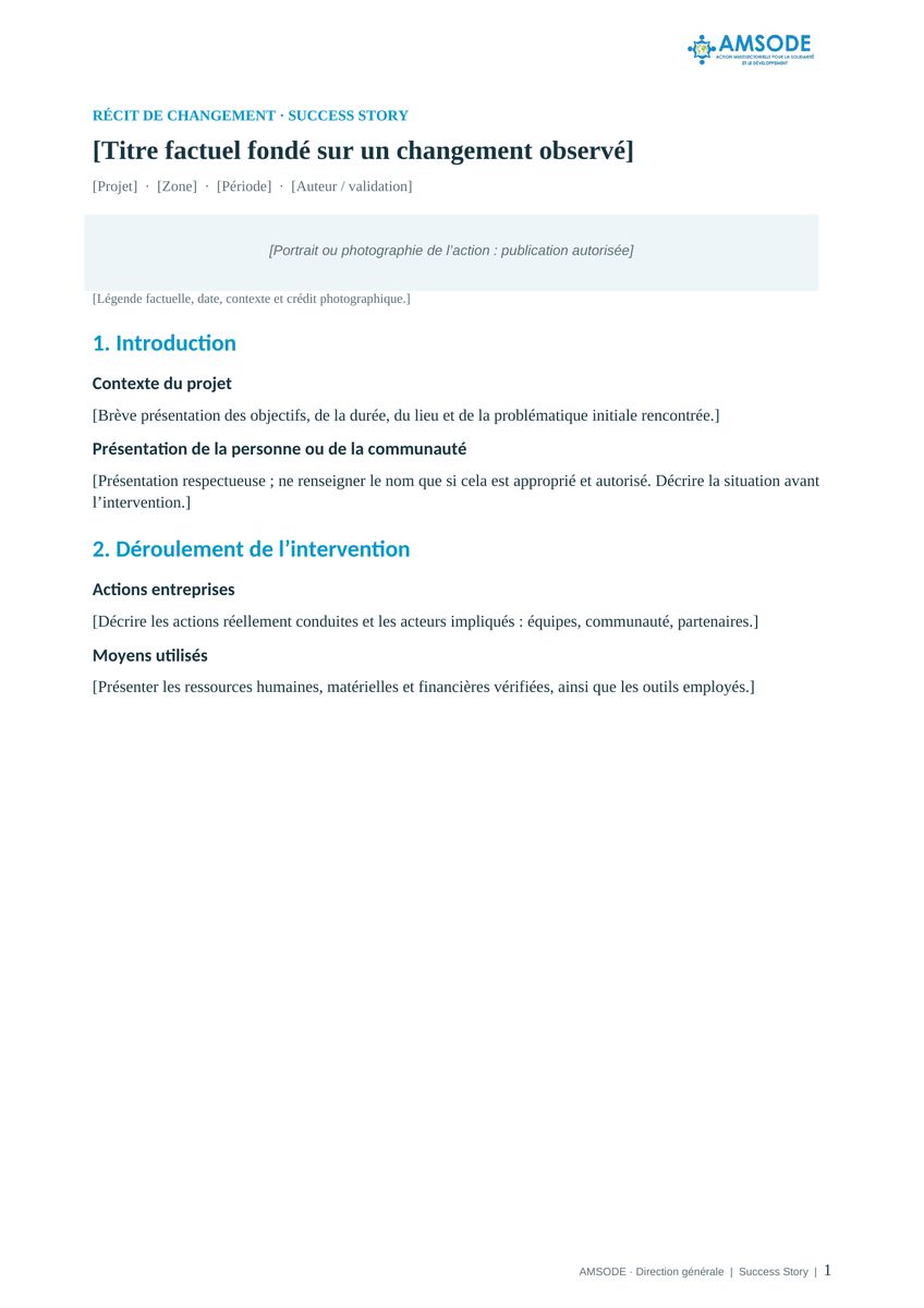
Editable Word templates

Approved model Main components Working format
Institutional report Cover, table of contents, activities, documented results and annexes. Editable Word + PDF preview
Project brief Context, objective, activities, indicators and documented partnerships. Editable Word + PDF preview
Success Story AMSODE framework: context, intervention, changes, testimony and publication rights. Editable Word + PDF preview

Use the approved model to prepare the document, then replace all placeholders with verified project information and complete the necessary editorial checks. The HTML previews may be viewed in the browser but are not offered as downloadable files.

↑ Back to contents

Browse approved reference models

The approved working templates listed below are currently in French. The PDF layouts and editable source files retain their approved formats. Preview pages open in the browser; HTML files are not downloadable.

CHAPTER 09 / 11↑ Back to contents

09 · Presentations and Digital Content

Presentations and Digital Content

AMSODE presentations and digital content must reflect the same official identity across channels. The online guidelines are organised as a navigable document, with a clickable table of contents, internal links and models that can be viewed in the browser.

9.1

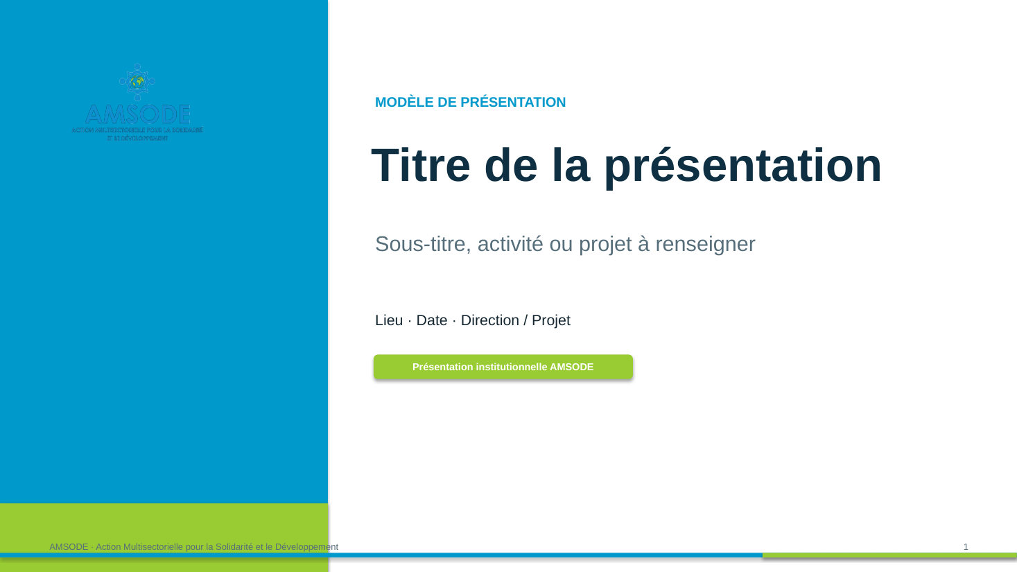
Institutional presentation

Use the editable institutional PowerPoint as the starting point. It provides the slides commonly required for an introduction, context, chapter dividers, substantive content, photographs, key figures, tables or charts and a conclusion. Replace the sample titles, images and figures with approved content in the editable PowerPoint file.

Use the official logo, institutional colours and a stable hierarchy throughout the presentation. Photographs and data must be checked before external circulation; layout examples do not establish operational results.

↑ Back to contents

9.2

Digital publications

Facebook, LinkedIn, YouTube and X share AMSODE's official identity while using content appropriate to each platform. Prioritise contextualised messages, verifiable sources, accessible captions or subtitles where needed, and photographs approved for publication.

Headlines should communicate the essential information immediately. Maintain appropriate safe areas for logos and text, including in mobile and video formats. Avoid claims or statistics that cannot be traced to validated project evidence.

↑ Back to contents

9.3

Approval before release

Check names, dates, figures, sources, credits, image rights and partner logos. Institutional messages must pass through the designated approval process before publication.

↑ Back to contents

9.4

Approved digital models

Approved model Purpose Working format
Institutional presentation 16:9 slides with editable headings, photographs, figures and tables. Editable PowerPoint + PDF preview
Social media post Identity markers, contextualised message and publication checks. Browser preview
Digital content outline Message planning and editorial approval framework. Browser preview

HTML is a consultation format on the portal; it is not offered as a downloadable file.

↑ Back to contents

Browse approved reference models

The approved working templates listed below are currently in French. The PDF layouts and editable source files retain their approved formats. Preview pages open in the browser; HTML files are not downloadable.

CHAPTER 10 / 11↑ Back to contents

10 · Print and Event Materials

Print and Event Materials

AMSODE's approved print and event materials include posters, leaflets, banners, roll-up displays, staff clothing and event identification. Their layouts retain the official logos and the visual structure of the organisation's actual reference materials.

10.1

Selecting and producing materials

Choose the medium according to its function: community information, event visibility or staff identification. AMSODE uses only 2 × 1 m and 3 × 1 m banners. The institutional roll-up display is 85 × 200 cm.

PDF files are reference layouts at the stated final sizes. Before production, check all wording, partner logos, bleed margins, finishing requirements and the supplier's technical specifications. Sample text is not a confirmed project statement.

Posters and leaflets

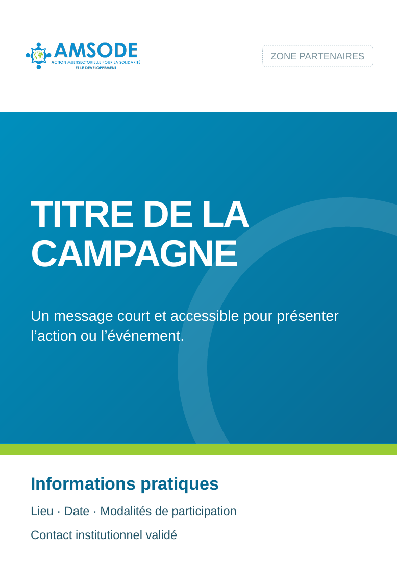
The A3 poster gives priority to the headline and essential practical information. The double-sided A5 leaflet provides more space for the message; contact details and photographs must be checked before printing.

Event signage

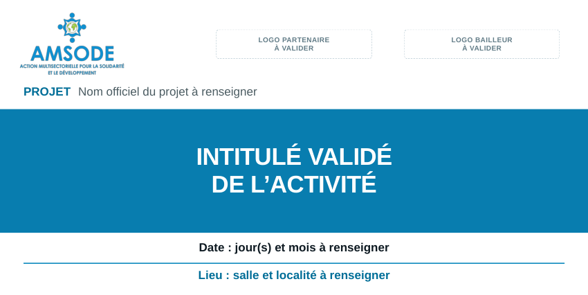
The 2 × 1 m and 3 × 1 m banners have distinct hierarchies for the logo row, title, project details, location and date. The 85 × 200 cm roll-up uses a vertical composition. Partner logos must follow the agreed visibility obligations for the activity.

Clothing and a complete event setup

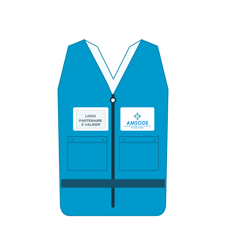
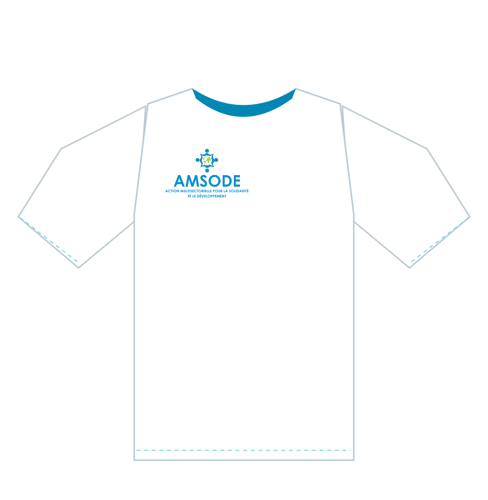
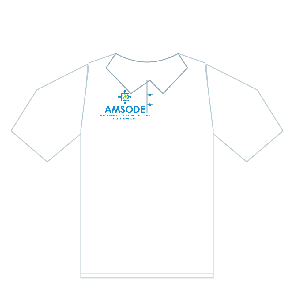
Field vests, T-shirts, polo shirts and caps retain their approved marking positions. Banners, roll-up displays, desk nameplates and signage should form a coherent event environment. Confirm fitting dimensions, fabrics, embroidery and printing techniques with the manufacturer.

↑ Back to contents

10.2

Posters and leaflets

Approved model Specification Reference format
Institutional A3 poster Portrait A3 layout for activities and event announcements. PDF
Institutional A5 leaflet Double-sided A5 layout for distributing information. PDF
↑ Back to contents

10.3

Banners and roll-up display

Approved model Specification Reference format
2 × 1 m banner Row of logos, project, central title, date and location. PDF
3 × 1 m banner Partners at the top, central message and funding acknowledgement at the bottom. PDF
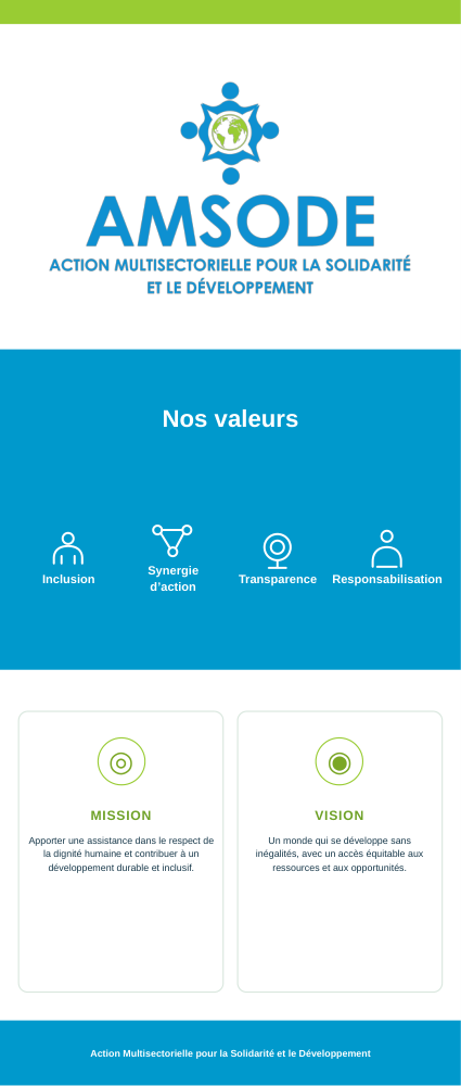
85 × 200 cm roll-up Vertical AMSODE identity, organisational values, mission and vision. PDF

Only official approved third-party logos may be inserted, according to the applicable agreement. Final trimming and roll-up mechanism clearance must be confirmed before fabrication.

↑ Back to contents

10.4

Staff clothing and marking

Approved model Specification Reference format
Field vest Front and rear views, AMSODE identification and designated partner areas. PDF, two views
T-shirt Blue collar, small front logo and larger rear marking. PDF, two views
Polo shirt Buttoned collar with consistent logo placement. PDF, two views
Cap Two reference views with the main approved logo centred on the front. PDF, two views

The textile supplier must confirm actual marking dimensions and manufacturing methods. The printed and textile models do not authorise a partnership or a particular funding credit on their own.

↑ Back to contents

Browse approved reference models

The approved working templates listed below are currently in French. The PDF layouts and editable source files retain their approved formats. Preview pages open in the browser; HTML files are not downloadable.

CHAPTER 11 / 11↑ Back to contents

11 · Co-branding and Donors

Co-branding and Donors

Co-branding allows AMSODE, partner organisations and donors to appear on a shared communication material without distorting their identities or confusing their roles. The composition must make each role understandable instead of turning the material into a collection of logos.

11.1

Identify the role of each organisation

The appropriate layout follows the role defined by the actual agreement. Do not infer an operational or funding relationship solely from the presence of a logo.

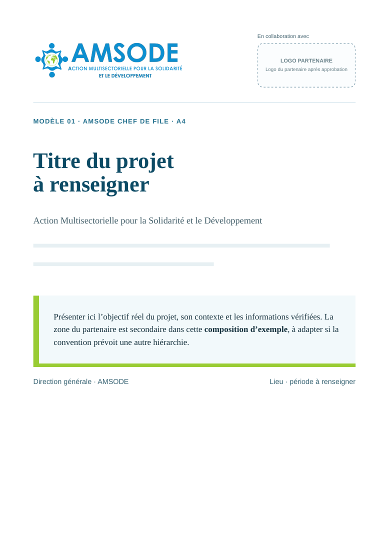
  • AMSODE as lead organisation: AMSODE's official identity may be visually emphasised where the agreement permits it.
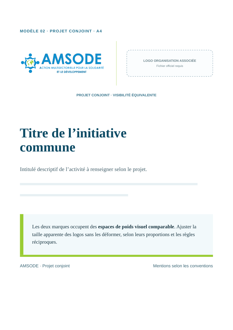
  • Joint project: the organisations receive visually comparable areas, according to the agreed rules.
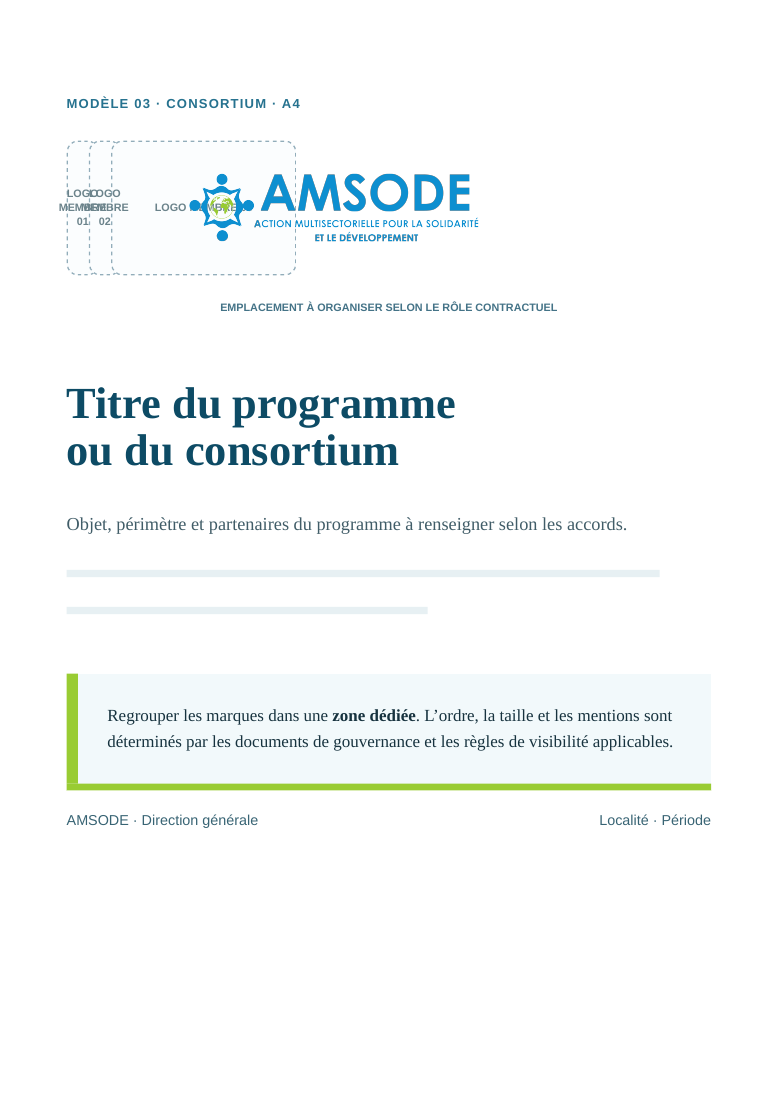
  • Consortium: partner logos are organised on an approved grid with an explicit hierarchy reflecting their roles.
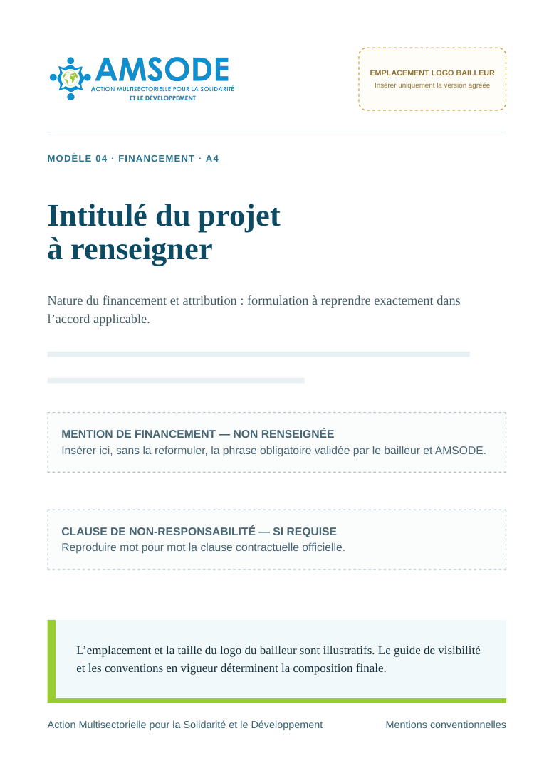
  • Donor: logo use, display order, funding acknowledgement and any clauses follow the applicable documents.
↑ Back to contents

11.2

Preserve logo integrity and legibility

Use only unmodified official logo files on backgrounds that provide sufficient contrast. Set clear space, baseline and apparent size according to each logo's proportions, never by stretching or distorting it.

  • Maintain free space around each mark; do not place text or a rule too close to the symbol.
  • Use a shared grid and consistent spacing. Logos of markedly different shapes may require different technical dimensions to achieve comparable visual weight.
  • Place partner marks in a dedicated strip on a cover, in a header or in a footer, as appropriate to the medium.
  • Use only the approved colour, black or white variants. Never apply arbitrary recolouring.

Recommended: distinct areas, sufficient margins and intact proportions. Avoid: distortion, inadequate contrast or a display order that contradicts the relevant agreement.

↑ Back to contents

11.3

AMSODE as lead organisation

Where AMSODE is the formally designated lead and the agreement authorises visual priority, the official logo may appear in the principal identity area. The partner is identified in a separate space with wording that reflects its actual role.

Reference model: A4 layout — AMSODE as lead organisation.

↑ Back to contents

11.4

Joint projects: balanced visibility

For a genuinely jointly managed initiative, allocate comparable visual space and use a consistent alignment system. A fine divider or sufficient white space may separate the marks without implying a hierarchy that has not been agreed.

Reference model: A4 layout — joint project.

↑ Back to contents

11.5

Consortium: one grid for multiple organisations

Where several organisations are involved, group their logos in a coherent zone. The lead organisation, implementing partners and financial supporters are not interchangeable; identify their roles explicitly.

Reference model: A4 layout — multiple organisations / consortium.

↑ Back to contents

11.6

Funding and mandatory acknowledgements

Before producing donor-funded material, check the funding agreement, the current donor visibility guidelines and all required approvals. Displaying a logo may not be sufficient: funding statements, editorial responsibility and disclaimers may be prescribed.

  1. Obtain the donor's official logo and respect its required clear space.
  2. Reproduce the exact approved funding statement; do not substitute generic wording.
  3. Include a disclaimer only if required, and use the approved formulation.
  4. Retain the applicable guideline reference and evidence of the authorised approval.

Reference model: A4 layout — donor-supported material.

↑ Back to contents

11.7

Event banner with partners

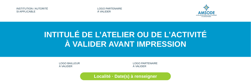
For co-organised or funded activities, the event message remains the visual focal point. A clearly defined area groups partner and donor logos in accordance with the visibility commitments. AMSODE banner sizes remain 2 × 1 m and 3 × 1 m only.

Reference model: 3 × 1 m banner — partner and donor layout.

↑ Back to contents

11.8

Check compliance before publication

The General Directorate, together with the project staff authorised to do so, confirms compliance before a material is printed or released. Production records retain the official files, approved wording and the version used.

  • Confirm the exact roles: lead, joint leads, implementing partners and donors.
  • Check the signed agreements and applicable visibility guidelines.
  • Import official logos and preserve their approved variants and proportions.
  • Review legibility, margins, alignment, colours and the intended final medium.
  • Approve acknowledgements, credits, funding clauses and dates before release.
  • Archive source files and evidence of approval, then export the final version.
↑ Back to contents

11.9

Approved joint-communication models

Approved model Intended use Reference format
AMSODE as lead AMSODE's official logo is prioritised only where its agreed institutional role permits. PDF
Joint project Balanced visibility under the relevant partnership agreement. PDF
Consortium A common grid for organisations whose roles have been confirmed. PDF
Donor-supported material Funding statements and logos follow the contractual obligations. PDF
Banner with partners Event composition with the approved third-party identities. PDF

The templates are approved layout references, not confirmation that a particular partner or donor is involved in a particular project. Use the officially approved logo files and activity-specific wording in every final material.

↑ Back to contents

Browse approved reference models

The approved working templates listed below are currently in French. The PDF layouts and editable source files retain their approved formats. Preview pages open in the browser; HTML files are not downloadable.

↑